Brightside email design
Brightside is a service that helps people find expert, affordable depression care from the comfort of their homes.
Ask
Design a series of email templates to support Brightside’s outbound communications, from signups to patient check-ins.
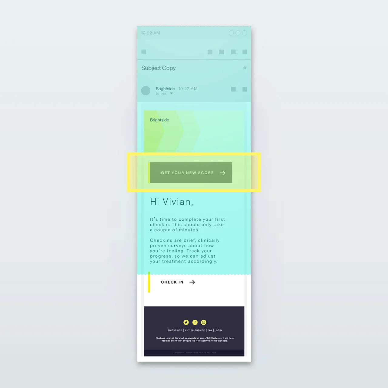
Depending on the device, the call-to-action may appear below the fold upon initially opening the email.
An updated version of the original places a more prominent call-to-action above the fold.
Approach
I worked directly with the two cofounders to examine their full conversion funnel, and helped them identify points that could benefit from clarity of communication. As an early stage company gaining lots of traction, there’s still a good piece of the onboarding flow that can be finessed.
Compared to their original templates, I cut content to increase clarity, added calls-to-action in various forms to drive follow-through, and added large messaging up top to drive communication - not requiring people to read every word, but still click through and complete a the required task.
Services
Product Design, Web Design


