Yelp redesign
Personal product design exercise. A rethinking of the Yelp mobile experience.
Ask
Without changing the back-end schema through which data is organized and consumed, rethink the UX of Yelp mobile search and its venue profile pages.
Approach
Yelp is incredibly powerful. It's best-in-class in terms of data and an essential app for accessing basic information about restaurants and venues. However, many features have been added at the expense of its core value - easily searching and displaying venue information.
My process consisted of 3 steps:
01: User interviews and business requirements
02: Brainstorming and wireframe creation
03: UX and visual design
01
I spoke with twelve Yelp users to define product needs and with one former employee to ensure I was keeping Yelp’s business needs top-of-mind.
While recommended restaurants and reviews needed to stay for business reasons, I learned that users didn’t want Yelp to be the best-looking app for discovering the hippest new restaurants. They wanted an app that helps you quickly and easily find the venue that fits your needs...now.
02
Function is paramount. Along with an updated aesthetic, Yelp needed more efficient search filtering that was simplified and more easily-accessible.
I began wireframing, and decided to move forward on an updated map view with vertically scrolling search results and a prominent new filter button.
03
SEARCH: When opening the app to start a new session, every user I interviewed ignored the initial map results and went straight to the search bar. Users should be deposited on a clean search input, with the location input defaulting to current location.
SEARCH RESULTS: Beyond a new graphic toggle that allows quick switching between map and list views, the largest addition here is a new floating filter button, which reveals a revamped filters menu. Users often missed the 'quick filter' buttons at the top of this view in the current app. These text-heavy buttons were removed in favor of a more centralized filtering system. Now, whether on map or list view, you are one tap from filtering your search results.
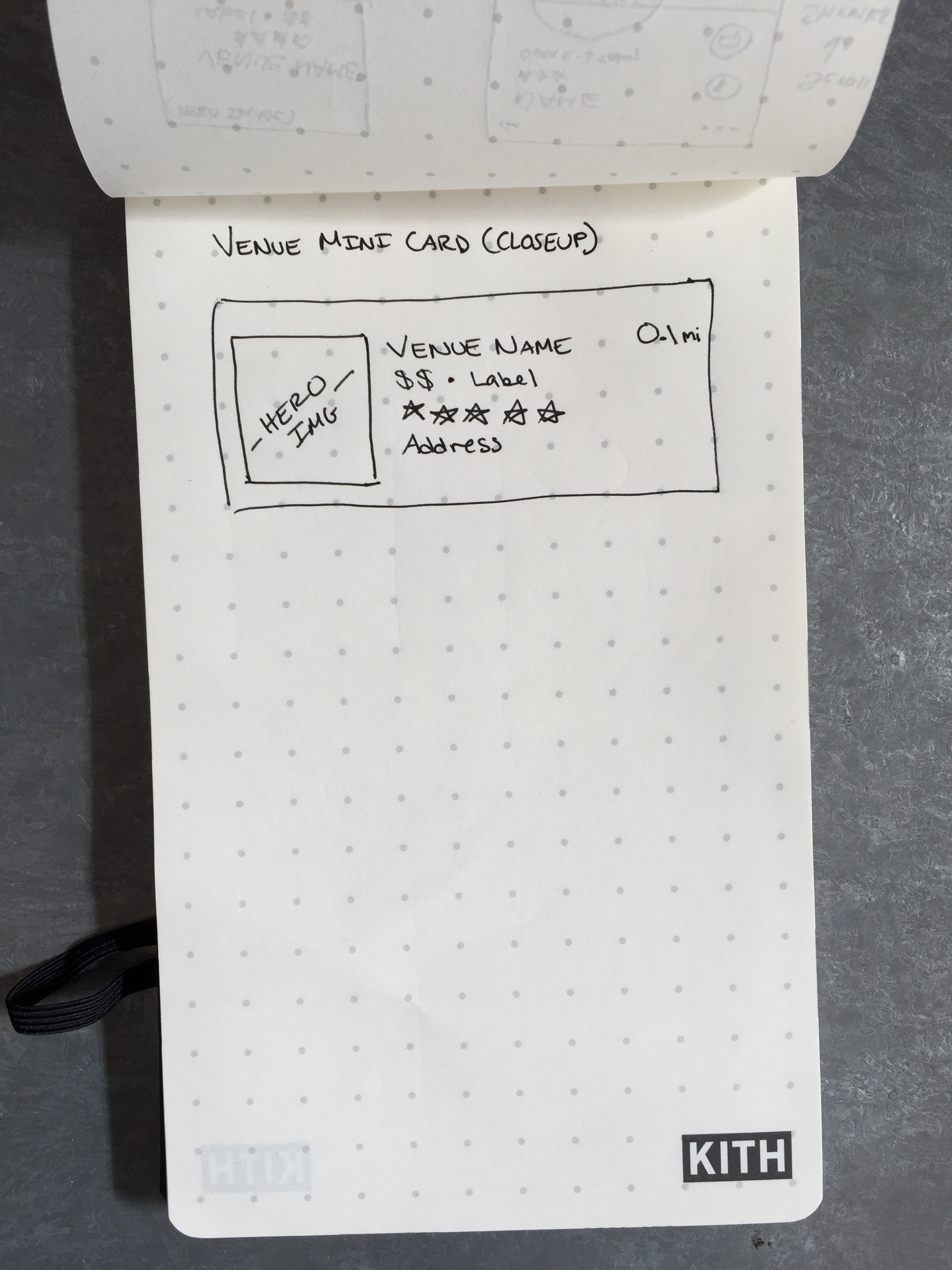
Tapping map markers brings up an updated venue card that now displays an image to better help users evaluate options without having to click into the venue's profile view.
The list view now employs a card system, rather than the stacked bar system currently in-use by Yelp at the time of this exercise. Seeing a slight shadow around each venue helps visually differentiate them from one another, enabling quicker scanning.
FILTERING: Interviews showed that filters are almost always added after an initial search. To streamline the search flow, the filters button was removed from the initial search input.
Beyond being updated aesthetically, filtering options were rearranged to reflect those most-used by users and the strongest business cases for Yelp. For instance, due to Yelp's Nowait integration, I made sure to place the ability to filter by wait list availability higher on the menu.
3D TOUCH: While this feature needs some more time to be thoroughly explored, I've often wanted to get a small piece of info about a venue that is buried on its venue profile page.
When doing customer interviews, two users mentioned they would love an easier way to quickly share a restaurant with a friend (other than copying and pasting the address in a text message manually). This feature already exists, but it's so buried in Yelp's UI, that most didn't even know it was there. 3D Touch was a fun way to quickly make some of these options available to those who seek them out.
VENUE PROFILE PAGE: While most of my research focused on search, there was a fair amount of discussion around reviews and 'saving' restaurants based on various criteria.
But I did want to give the hero portion a quick refresh. Key information like food category, daily hours, and rating are still clearly portrayed while cost and number of reviews (two of Yelpers’ most desired traits) are now given more emphasis. Swiping horizontally within the menu bar will trigger horizontal paged scrolling, allowing the user to access simplified and restructured Reviews, Collections, and Settings sections.
Future iterations would consider a more readable system for displaying long-form reviews, simplifying secondary information (directions, addresses, noise level, etc.), and cleanly displaying action items like making reservations. Now, I’m hungry.
Services
Research, Product Design, Visual Design


